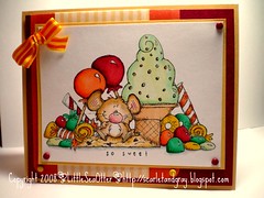
This was a very frustrating coloring experience for me. Allow me to explain...
Last year, I bought this adorable Whipper Snapper image in Wisconsin. It hadn't seen ink until this weekend. Not because I didn't like the stamp...just because I wanted to color the image perfectly because I like it so much.
So, when I saw this week's Inspiration Challenge #119, I immediately thought of this image. Could I do it justice? NO! I tried, and tried and tried through several attempts. I wanted to use the same bold color scheme as the inspiration piece, but I found it was too many colors and it seemed entirely too busy with color.
My final attempt is what you see here. I decided to reduce the color palette to the colors you'd find in a roll of classic Life Savers...still bold, just less busy.
I still remain layout challenged too.
But hey, I learned a lot from the process, I think. Back on the shelf this stamp goes. I'll hopefully try it again later, with much more success.
Monday, March 17, 2008
Subscribe to:
Post Comments (Atom)

3 comments:
R U kidding? The card looks fabulous. Your colouring is fantastic and the colours look great!! You must either be fishing for compliments, or be very hard on yourself. I suspect it's the latter, LOL.
you are kidding, right? This is gorgeous!! Take that stamp off the shelf and get moving!!! Kerilou SCS
Well I think you did an awesome job coloring this image. I only wish I could color an image that well.
patty
www.paperpiecingpaty.blogspot.com
Post a Comment